Here we have the horizons of Venus - Earth - The Moon - Mars - Titan
A closer look at the one second from the left, reveals the fundamental inspiration for TODAY.
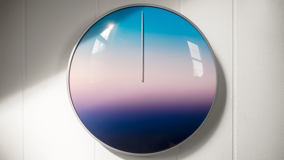
timeless
The first time I began working on the design for TODAY was back in the spring of 2015.
First sketch of TODAY
For about a half a day I wanted to make it more literal (I don't know why) so I mocked up this cringeworthy design.
I liked it enough, at the time, to print it out.
The first print of TODAY
Thankfully I slept on it, woke up and realized it looked pretty bad. I still lived with it for a few days, though. In my defense, I think I was trying to create my own version of the Yin-Yang symbol - a graphic-philosophy that has always fascinated me.
Hmmm,
Something about the second take below felt strange after living with it. There was too much focus on the 6am/6pm factor. It felt too slim and had the affect of increasing anxiety around those times. The cloud line was too thin.
take two - removed the sun and moon / exploring the cloud element.
So I mocked up a new one...
and printed it out.
Notice the dramatic difference in the screen quality and the print!
Printed on my dying 2005 inkjet printer.
I am inspired by the work of Hiroshi Senju, a Japanese artist with a particular talent for illustrating timelessness.
What I love about his work, in particular, is the impossible nature of the mist.
Saw this in person at SCOPE in Art Basel // Miami in 2011.
The technique he has mastered makes it extremely difficult to discern where the mist ends and the dark space behind it begins.
See what I mean?
I wanted to have the same dissolve quality in TODAY.
Not only because it's beautiful but it speaks to the nature of how a day moves through time. Additionally and perhaps more philosophically, I believe it's healthy to have reference points in your life that reinforce your ability to detect and appreciate subtlety.
And finally, to accept the full spectrum of life's experiences - to escape from the narrow-minded torment of seeing things, in black or white.
You can get a normal clock on Amazon for 11.99 that will help reinforce your perception that life is a matter of black and white. It will also make you believe that the present is a hairline fracture between the past and the future.
So I began to fuss with the gradient and spread out the cloud line to illustrate the grace of movement as dawn lifts into day and dusk, sinks into night.
After several dozen versions, I landed, more or less, here.
The image above is 1/60 of the quality I use to print, but it hardly matters as the difficulty in achieving the perfect gradient print, has at times, seemed impossible.
Take for instance the print, as it was a few weeks before launching the Kickstater.
Let's face it - it's ugly.
I will now do my best to show you the evolution of the print.
Still pretty bad. The dissolve is more of a cut, this defeats its purpose.
Saturation is better but we still have banding and a harsh cut off on the bottom.
This is the same graphic from a different angle. It's a nice photo but the print still has apparent banding issues. Also, this is an old hand.
At this point, I had to change the company that was printing it as they gave up, saying this was the best they could do. They thanked me for testing their limits but refused to print it again.
So I found two new printers.
The first one basically gave me the same thing.
Another take at the graphic, still not there - updated hand installed though.
The second one - a legendary NYC based firm, gave me a handful of prints on different surfaces. The print on Sintra is what was used for the main image below, on Kickstarter.
This looked good enough to post as the lead on the project page, so why not just use this?
Well, in this case, looks are a bit deceiving. Sure, this works great for an image but the quality of the print in person needed work. It had a shiny quality that made it look cheap at arms-length and the print lines are very clear in person.
Lines added to point the embedded ones out.
Why not use the method you used when you printed ThePresent?
Great question ghost of self-consciousness!
Okay, so the original prints on the first 2000 clocks were laid down on a matte paper using a Heidelberg 6 color ink printer the size of a semi-truck. The quality was nice but the question was, how do we attach it to the face in a way that doesn't color-drain or get damaged over time?
To make a long story short - a lot of the original clocks have drained in color, becasue of the paper and over the past few years an unfortunate few, have had the paper peel up on them in especially humid environments.
Taking on another round of clock making has given me the chance to fix all the things I always wanted to improve, e.g. safety glass, longevity of print color, remove the possibility of print peeling, steel that is impervious to rust and a few other things that are too detailed to itemize here.
So what we need is a printing process and material that lasts as long as possible and can be permanently attached to a metal face. In the case of the bamboo, the print also has to last well, forever and be impervious to scratching damage. Fingerprints also need to be able to be wiped off without affecting the print quality.
The solution was to use the same material I had been experimenting with, on the early bamboo prototypes of ThePresent.
It's beautiful
The color goes right to the edge.
How does the color go all the way to the edge?
The graphic is reverse printed to the back of a proprietary photo-film made by a US company that was founded in 1913. Because the print is UV printed on the back, the front of the film protects the graphic with a "Velvet Matte" layer that resists UV damage and scratching.
It's a little tough to photograph but the tactile quality of these Velvet Matte prints are wonderful. I sourced this specific material after feeling my way through hundreds of potential substrate samples. I actually got the point where I closed my eyes for the final 10 samples and chose the one that felt right.
Shot on my iPhone in direct sunlight.
Great Scott!
So, just print the TODAY graphic on that same material and call it a day genius.
Right. Unfortunately, all of the prints (with the exceptoin of the Sintra) I've already shown you above were printed on this same velvet matte and it's why the printer finally said they can't do it. However, they refused to give me the specs on the material. (trade secret?!)
The NYC firm agreed to keep at and find the right material but admitted that it will take time to source the material and get the print right. In the meantime, they suggested printing directly to the bamboo.
First: I did not know this was possible.
Second: I was skeptical.
Third: They didn't charge me, so I said go for it!
The following is a brief look at a few moments during the evolution of printing directly to the bamboo. We were going through these motions while I continued to disapprove of Velvet Matte replicas and unreliable results.
Too light - You see the wood too much. Not transportive.
Closer but unnecessarily dark when it's not in direct sunlight.
Even got a "second-opinion" from an alternate company. However the print quality was inferior to the NYC firm.
When I saw this I thought that it nailed it. It's hit with 100% white at first then hit with 100% graphic. Two prints on one surface.
Here it is on my brick steps outside.
Here it is on the small 5" bamboo - Direct to Bamboo printing.
Since the graphic of ThePresent prints beautifully on the Velvet Matte, I ordered and have all those prints already.
11" Bamboo Print doubles as the 11" Steel and Glass face for the clock.
5" Bamboo - Uniformity between all three products achieved.
Yes, I love the printing directly to bamboo. I also love that I was able to get to the bottom of it with no cost to the project. The NYC firm really wants to work with me and that makes all the difference in the world.
Printing to Bamboo vs. Printing to Velvet Matte
This has been an ongoing flip-flop trip since we figured out how to print to bamboo beautifully. I change my mind on it completely at least twice a day.
ThePresent actually does not print to the bamboo as nicely as the TODAY graphic does.
No matter how much white you lay down first, you still get a sense of the horizontal bamboo lines which throw off the alignment of the circular spectrum. TODAY, on the other hand, works effectively on the bamboo as any visible bamboo lines add to the dissolve effect of the day.
See how that works? That's industrial design for you! One thing works perfectly in one way, while the other doesn't work and vice-versa.
A lot of backers purchased ThePresent and TODAY and intend on having them side by side and a Velvet Matte Present next to a Direct to Bamboo TODAY will be slightly different.
If the NYC firm was able to source the Velvet Matte material and get the print right, I think I would hold off on the direct to substrate printing for now and possibly offer it in the near future. Actually, there is a good chance, though, that this will be the only time I make the clocks out of bamboo. The cost of making this clock in bamboo is more expensive than making it with steel and glass and yet I have a lower price point for them.
Last week the NYC firm presented the Velvet Matte to me after sourcing the same material finally and giving a shot. This sample is one of 5.
The closest yet
This is a crummy picture in bad lighting but in person, this looks very strong. I am confident with one more round of tests I will be able to order several thousand of the prints that will bring unity to the Steel and Glass clock, the 11" bamboo and the 5" bamboo clocks for TODAY.
I'm certain, at this point, that I am challenging your patience with the length of this update. So I will try to wrap it up but I need to at least mention another major factor at play here in Velvet Matte vs. Direct to Bamboo.
Those major factors are how it is applied. The direct to bamboo prints perfectly align graphics on a 4'x8' board - but then they have to be cut out one by one with a CNC machine, introducing an unknown number of throw-aways from chipped edges. In the samples we ran 3 out of 7 were already damaged, so it is fairly unreliable. Sure that number would drop as we move away from tiny batches of prototypes but it's still an issue to consider.
After the CNC cuts them they need to be handled and sanded prior to coating, again, introducing a lot of danger in each step of the process, as the print has to be made first. The worst case scenario is chipping the print itself and having to toss the entire piece of bamboo.
But the Velvet Matte also has its own nut to crack, because the film has to be applied extremely carefully to each piece of bamboo. I have some TODAY stickers that I've been putting around New York and trying to get it lined up evenly is well, nearly impossible. Just one mistake as I'm applying the graphic, and I'll have to toss it. At $6.91 per-print, those mistakes get expensive fast.
So we are developing a process with the help of the NYC firm, to make sure that it's as easy as possible to fix the print to the bamboo face without issue. In addition, after the face is on the bamboo, the edges need to be cut with a razor as no matter what, there is always a little bit of an overhang somewhere along the circle.
Again, make a mistake and I'll have to peel the graphic off and start over. harm the actual edge of the wood in the process and I'll have to try to salvage it by sanding it down or lose the piece completely. At a cost of $32 for that piece of machined, sanded and coated bamboo, those mistakes will also add up fast.
I'd like to end by making it clear that the main culprit of the delay actually doesn't have much to with anything above - the Steel and Glass have a whole other solar system of issues that forced me to delay the shipment.
Over the past few days, I've been more comfortable believing that I'm going to go for the Velvet Matte on TODAY than direct to bamboo, but I'm open to hearing opinions one way or the other. I'm almost certain that if I took a poll, it would be 50/50, so you'll have to trust my final decision on this.
I know this update is long but really, I've left out a ton of details.
The most time-consuming thing so far is the back and forth between vendors. A few thousand clocks (I'm making 4,500) seems like a lot, but it's still small potatoes to the firms I'm working with. They are doing their best but I'm always on the gradient between being patient and bugging them like crazy. It's a large coordination effort that would not be possible without the help of Russell Greenberg, Minchul Hong and their industrial design firm RUX.
Last week we sent the final approved files for the packaging!
It says: TODAY is the 24-Hour timepiece designed to change the way you see your day.
It says: ThePresent is the 365-Day timepiece designed to transform your perception of now.
Please include your name and the name of the person I'll be addressing. Not critical, but if there is anything you want to share with me to make it more personal please let me know.
The personalized video card is a way for me to explain to the person what they are getting, why I am making it and why there is a delay.
Received the steel back, rims, inner cups, print plate & battery backplates for review last week. They are strong and it looks like the fine satin finish was a good choice. Every picture felt out of focus when I tried to shoot a close up of the steel. Turns out that the best test for a smooth finish is to have a lot of trouble finding a focal point in a close up shot.
This round was all about making sure the 5 pieces fit together perfectly. We are close but there does need to be some changes to the tooling before full production begins. The thing that takes the most time is the "measure-twice-cut-once" principle. Except, in this case, it’s "measure 22 different points across 5 pieces many, many times over before cutting."
The primary goal beyond great looking steel is to make a natural snug fit between the rim in a way that keeps the glass “locked” in place. Now, the glass would not fall out if I just went ahead and produced all 17,000 individual pieces but the glass would certainly knock around and feel loose (amongst other low-quality signifiers) if I was rushing to get these out.
It’s important that the glass feels like a part of a whole, instead of a separate piece. If the glass wobbles in place, slides or spins - it feels unfinished. It’s got to feel solid and tight when you hold it. Even though the time that Today or ThePresent will be in your hands is extremely short in comparison to its true function of being on your wall - I don’t think it is something that should be glossed over.
The “shaky” glass problem is a great example of the level of detail we are operating in at the moment. With an organized effort to change microns of dimensions to bite down on the glass with just the right amount of pressure, the glass also has to hit a perfect angle. This sample from last month was the closest yet, but it is still off as you can see.
Unless you want to go deep, stop reading now.
Listen, I adore, no, I love, the original clocks that I’ve made and I do not dare disparage them on this public forum. A hundred years from now, they won’t just be “Collector’s items” they will be in the Smithsonian as the first clocks responsible for reconnecting time to nature and transforming the way the world measures life.
However, nothing you make is ever exactly what you want it to be the first 3,000 times you do it right?
So it has been a joy to go in and optimize some of the things that irked me about the first design. Even though it was rare, the shaky glass issue was one of them. That will be remedied. Another is that the hand on some of the clocks would dip and touch the face at certain points. This did not hurt the face, or the hand or even effect the movement - it just felt unpolished. So I’m doing all I can to make sure that the hand has at least a 2mm clearance all away around the face. Sounds easy right? Wrong.
This is a good example of the minutia we’re in.
The new tempered glass is almost 1mm thicker than the original glass and 100 times safer. I’ve hit the tempered glass with a hammer and it doesn’t even chip. But the combination of a thicker glass and a standardized 2mm clearance for the hand makes it so that the tip of the hand is touching the underside of the glass ever so slightly and once again, looks and feels unpolished.
So a lot of this is balancing between millimeters at the moment.
Illustration of fixed 2mm distance between hand and face
It requires a persistent dedication to detail by the design team that is sweating the tolerances and the machinists at the steel factory. Everyone in our chain of commitment is focused on long-term quality, and I owe that privilege squarely to you. Your encouragement to make the best product possible helped me level up the packaging and it’s been the driving force behind these fine-tuned details, which I guarantee you will feel when you pick it up and hold it for the first time.
Packaging Update
The last round of changes to the packaging was sent in a few weeks ago and we’re waiting on what we expect to be the actual packaging any day now. The main changes were structural. Since the EVA pushes the sides of the box against itself with no room to move, we removed the need for this eyesore on the bottom of the box.
uhm..ew..no
This may seem like overkill, but after passing the packaging around, a lot of people opened it upside down and the first thing you see is an unnecessary peek behind the curtain. So that’s gone now. Also, the sleeves were beautiful but they tore too easily and after leaving them out for a few days they began to warp in on themselves. You might say “Of course, it’s paper, without it being on the box it will warp.” But we’re not making a $2.49 paddleball -
we’re making works of art that are going to transform your perception of time. So we increased the gauge on the paper so that it stands at attention on or off the box. The packaging was so close last time that I have a good feeling it will be a wrap after examining these final samples.
All that will be left is adding the final text which can be printed and proofed pretty quickly. I’ve always wanted to have a slightly comic “Warning” message in small print on the bottom right-hand side of the back of the package. Something like,
"Caution: Living with Today will change the way you see normal clocks forever”
It’s going to be something playful but actually, I’m kind of serious - after living with one or both of these new formats of time, there is no turning back. You really will look at regular clocks in much the same way now probably look at cuckoo clocks, "Awwww, that's cute - but who on Earth would ever invite that racket into their home?"
Okay, that's pretty much the update.
I am always available at[email protected] if you have a direct question.
A personal note:
This is all personal - but this part is especially so - stop reading now if you sense a cringe coming on as I am certain there will be some cringe crumbs left over after reading this. It makes me a bit uncomfortable to write this - so, clearly, I need to write this.
I’d like to share two things.
The first is my perfect personal paradox:
I’ll never be gifted ThePresent or Today without already knowing what it is.
This fact is equally profound and heartbreaking to me. Profound because I am able to provide the opportunity for other people to experience these gifts for the first time and heartbreaking because I know I will never be able to not know what they are and have a friend give one of them to me.
I would consider it to be one of the most incredible things that ever happened to me, "A new way of seeing time...in the form of a clock...yes please, thank you very much."
I'd probably find out who made it and see if there was some way I could work with them because “this thing's to do!” as Hamlet would say. Well, he was talking about something completely different, murdering his uncle to revenge his father’s death, but I hope you get the point.
So it’s something that motivates me to get better at doing this every day so that more people can have the thing that I can never have. To see Today and or ThePresent for the first time. It is a powerful paradox for me, but the word paradox just feels mathematical, it doesn’t actually get at what I’m feeling.
There is a term in Japanese Aesthetics that does this sensation justice but the word has no direct translation to the English. That word is Yūgen (幽玄). Ambiguous and mysterious by its nature, Yūgen can maybe be summed up best by a Japanese Playwright who lived from 1363 - 1443.
"To watch the sun sink behind a flower clad hill.
To wander on in a huge forest without thought of return.
To stand upon the shore and gaze after a boat that disappears behind distant islands.
To contemplate the flight of wild geese seen and lost among the clouds.
And the subtle, subtle shadows of bamboo on bamboo."
Zeami Motokiyo
Zeami also founded the Japanese Dramatic Art of the Noh Theater. Which, if you ever get a chance to see it performed, please, please treat yourself to a show. I saw my first Noh performance this past summer and it was easily the most enchanting experience I’ve had this year. Seeing a performance where the masks they use are 600 years old brings whole new dimension to the notion of timelessness.
The second thing.
Living with both of the clocks is really working for me. I actually find that I am better at time and "timing" in general. Yes, including the archaic industrial era “normal” clocks. They certainly have their place but only in the context of ThePresent and Today, at least for me. This is and will continue to be a good thing for people and that gives me a constant source of hope.
I’d like to end this update with a testimonial someone shared this past summer when I launched Today.
by Christopher in NYC - Summer16
When I got the Present, I was a little skeptical. Within a few day’s it made a profound difference in my life. I had been trapped between the feelings that there was never enough time in the day and that there will always be tomorrow. Neither actually being true.
It gave me an appreciation of what could be accomplished over the course of a few days, weeks, and eventually months and seasons of persistence. It was so simple yet so radical.
I'm equally skeptical of Today but am placing my order, fully expecting to be as surprised by a new perspective on how we measure our days and lives.
Pretty Pictures of Packaging
over 7 years ago
– Sun, Nov 13, 2016 at 11:57:40 PM
What you're seeing here is the penultimate version of the packaging. The full-color sleeves fit neatly over custom matte black boxes.
I'm overwhelmingly happy with these as the reality is truly beginning to match my vision for these gifts.
Holding these packages puts me in a really, really good mood and I took these pictures today to share the feeling. I hope it inspires you to know that you're responsible to a large degree for making this happen!
Going to let the pictures do most of the talking.
11" Bamboo with Direct to Substrate printing
11" Bamboo Direct to Substrate detail
Any thoughts on this print? I've been developing it for months and this is the first time I've decided to share it.
It's printed directly onto the bamboo surface.
I adore it.
Seeing it in person is pretty special - it looks like a million dollars... or at least $284,000!
This print still needs work. There will be an update soon to show you the journey of the print which has been by far, the most difficult element.
fun!
Check out the brass pin solution for the desk clock tilt.
Brass pins come with the Desk Clock. They can be inserted and removed as you wish. The desk clock can also be used as a small wall clock.
Hand detail
still a few minor changes but getting very close.
ThePresent packaging. In both cases the texture is a soft matte paper.
this is the small desk clock of ThePresent - the box above is for the Steel and Glass version.
I was slightly skeptical of using all black in the packaging but now I can't see it any other way.
example of what I'm after in the print quality of Today and the gradual dissolve.
For anyone who backed Today and never saw the original 'ThePresent' Kickstarter video, I highly recommend taking a look.
I'm currently reworking it now to include both ThePresent and Today, as the inspiration behind both is the same: To change how we relate to time.
I stumbled on a bunch of testimonials for ThePresent that I've never gotten around to sharing but thought you might be interested in reading them.
I have nearly a hundred reviews with a similar tone.
"Scott, why would you not share these?"
I've done little to no marketing because I've constantly been caught in a cycle of selling out of all the clocks I make faster than expected. So marketing a product I don't have any inventory of is counter-productive, to say the least.
So I've been keeping things like this under wraps. I will have enough inventory in 2017 to begin sharing things like this - but wanted you to get a sneak peak.
"Wait a second... these testimonials are insane. Are you trying to put a dent in the universe?"
Absolutely not.
....plenty of dents in the universe already.
Doing my best to pop one back into place.
Fix-A-Dent
Our relationship with time is long, long overdue for an update.
Seeing something as old as time in a new way is, as far as I am concerned,
now more important than ever.
On my way to share Today and the new packaging with the MoMA Design Store. They want TODAY! But not until you get yours first.
Thanks for reading and for supporting this project.
I love engaging with the thoughtfully considered and well-written articles of Brain Pickings. Maria’s work always seems to both satisfy and compound intellectual curiosity. I felt her exploration of the value of time, was apropos to the journey we are currently on together.
“Progress is incremental, both as individual creative beings and together as a society and civilization. The flower doesn’t go from bud to blossom in one spritely burst. It’s just that culturally, we are not interested in the tedium of the blossoming. And yet, that’s where all the magic is in the making of one’s character and destiny.” - Maria Popova
As I head into another week onboard the train of thought that has arguably become my whole life, a train of thought that has produced and is producing these timepieces, I want to share with you where we are in the journey.
First, admittedly - I actually don’t know where this train of thought is going.
To elaborate on the train metaphor, I know that I there are stops coming up where I’ll be delivering clocks again but the ultimate destination remains unclear.
I mean, what’s “the peak” as it were?
Public installations of ThePresent and Today in cities around the world?
Donating tens of thousands of clocks to hospitals & recovery centers?
Framing the entire thing as a century-long science experiment on how living with new frames of time may or may not alter consciousness?
I intend to make all of these things happen but the scramble to produce the next few thousand timeless timepieces on time and under budget keeps the long-term future vision of ThePresent & Today within arm's length.
Secondly, maybe questioning what the “peak” will be is beside the point.
This is a life-long journey.
Recently I've been half-joking to people that I'll stop making the clocks in 2079 so my android grandkids can carry the LED torch into the 22nd century and beyond.
At the moment, when I look out the window I can see fall shifting the colors of leaves and I think of how lucky I am to have your support and generous patience as these clocks come together.
In some way, I feel like I'm simply the chauffeur of these timepieces and they are self-assembling.
“Okay dude, enough with these poetic metaphors, I’m giving these clocks as a gift to someone this December. It clearly says on the project page that the estimated shipping time is December 2016."
You're right, however, in my defense - I had no idea I was going to sell 10x the amount of clocks I expected to be making and delivering this December.
So I'm going to go ahead and pull the band-aid -
All clocks will be shipped on or before March 21st, the Spring Equinox of 2017.
I am happy to make personalized videos explaining what the gift is and why - to anyone who asks.
I've already made a dozen of them and I hope it can ease the pain of being unable to deliver at the estimated time.
Setting the delivery time to March is far more realistic. There is, of course, a solid chance that they will arrive for many of you earlier than March but I'm switching to an underpromising, overdelivering strategy.
Setting the delivery time to March confirms that the focus is on quality for you, myself and all the vendors involved.
If this is unacceptable I understand and I am willing to give a full refund, no questions asked - simply send an email to [email protected] with subject-line: Refund.
Amongst other things - at the moment I'm waiting on
Seeing the first samples from all the new steel tooling being made.
Seeing the final version of the tempered glass to confirm it fits perfectly into the steel housing.
All the bamboo has been purchased but the finesse of linking printing, machining, and finishing the bamboo has been time-consuming and tedious.
I was hoping to have the final packaging samples to share but I’m still waiting on getting those as well - I will share what they are making below but it's probably hard to tell the difference from the last update. We reduced the cost through some smart design maneuvers while also shrinking the packaging size and amount of unnecessary EVA.
Steel & Glass Packaging
Bamboo Wall Clock Packaging
Bamboo Desk Clock Packaging
Here is a mock-up of what I want the sleeve to look like - I'm giving the box making company a chance to print the sleeves as well as it makes sense to keep it in-house but I suspect the quality won't be up to par, so I have a backup printer to call on if they drop the ball.
GOOD NEWS! The instruction booklets were completed!
Looks incredible!
I LOVE it!
BAD NEWS! They did not use the most updated file!
Thankfully they recognized their error in not sending me a final proof and they are allowing me to return all of the booklets (to get recycled) and get what I paid for.
Sent these back to the recycling bin.
I'll be picking up the actual final booklets this week.
"So you're telling me you returned 4000 booklets just because you weren't happy with some of the writing on the inside?"
YES.
I've joined Instagram under @thepresent_today and I invite you to follow along. It's a simple premise, I post one photo every day of ThePresent as it changes throughout the year.